Primary Logo
Our primary logo embodies our brand's essence and should be used as the first choice in most applications. The logo combines our distinctive rocket icon with our wordmark in a clean, modern presentation.
Green Rectangle Format (Primary)
The green rectangle format is our primary logo and should be used in most applications. The vibrant green symbolizes growth, innovation, and our commitment to sustainability.
Color Variations
Our logo is available in several official color variations to maintain flexibility across different applications and backgrounds.
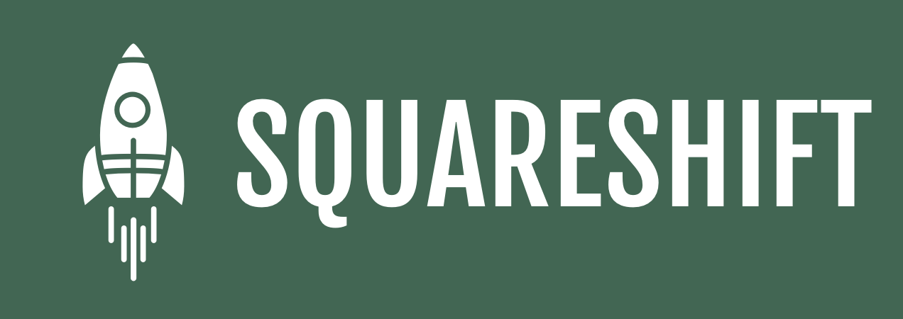
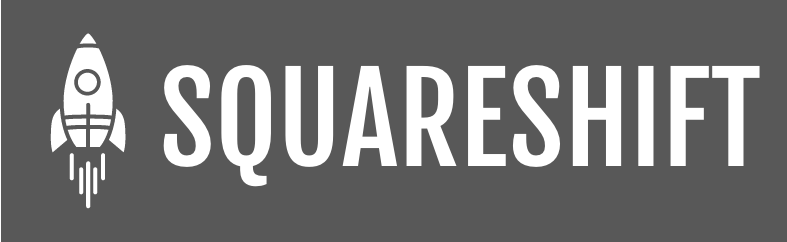
White Logo Variants
Our white logo versions are specifically designed for use on dark backgrounds:
Standard White
White logos should only be used on dark backgrounds where they provide sufficient contrast.
Format Variations
The logo is available in different formats to accommodate various design needs:
Primary Logo Usage Guidelines
- Always maintain the logo's proportions when resizing
- Ensure adequate clear space around the logo
- Use the primary green logo on light backgrounds whenever possible
- For dark backgrounds, use the white or gold version
- Don't place the logo over busy backgrounds without adequate contrast
- Don't modify the logo colors outside the approved color variations